
Whew! The One Room Challenge is serious! Serious pressure, and serious motivation! It's been an exhausting six weeks! I was working down to the wire, but now that our modern master bedroom redesign is finally complete, I am ecstatic to be sharing the reveal photos today!

Let me pause for just a moment to catch you up. The One Room Challenge is a twice annual blogging event hosted by the fabulous Linda, of Calling it Home. During the ORC, bloggers redesign an entire room in just six weeks time, sharing their progress each week along the way, leading up to the big reveal {that's today}. If you'd like to catch up on each of my weekly updates, you'll find the links at the bottom of this post.
There are twenty amazingly talented bloggers who headline each ORC event and nearly 100 more bloggers who join in the fun as linking participants {like me}. The headlining designers revealed their incredible completed spaces yesterday. And now it's time for the linking participants to take center stage and share their completed rooms. You'll find my reveal below, and links to all of the other reveals here.
In the spring, I participated in the ORC for the first time, designing a room for my toddler son that I dubbed his "Vintage Preppy Little Gentleman's Lounge." It was such a great experience that I couldn't pass up another One Room Challenge this fall.
This time around I took on one of the most neglected spaces in our home - the master bedroom! Isn't it always the case that we put our own space last? Our house is three stories, and our master bedroom and bathroom, together with a deck, make up the entire third floor. It's great having such a private space, but it wasn't living up to it's potential. Our room wasn't terrible, but it wasn't great. It had the beginnings of a style that represented us, but it was incomplete and felt blah! Back in Week 1, I shared my plans for the redesign, which would bring a hefty dose of our Modern Metro style to the master bedroom.
You'll notice that quite a few things in the room stayed the same - the major furniture pieces, the layout, and the comforter. But there are also a whole lot that's new - the light grey paint color {that replaced blah tan}, the drapes, coverlet, rug, chair, ottoman, and a whole lot of new art! The room now feels finished, and it's a much more grown up version of our style!
Ok, so enough with the explanation. Let's get on with the photos! You can find the complete modern master bedroom source list here.

Because the room has a fireplace {I know, so lucky!}, a large window, and two sliders - there's really only one good configuration for our furniture. When you enter the room - the dresser is immediately in front of you. We have a television on our dresser, and we really do use it daily, so it had to stay - but I've always hated that the tv is the first thing you see when you walk through the door. One of my major goals for the redesign was to make the television feel like less of a focal point - and the solution was to hang a gallery wall around the tv.

More about the gallery wall later, but first let me show you more before and afters!
On the bed side of the room, the art needed an upgrade upsize, and the nightstands were desperately in need of some styling!

I love the new paintings above the bed, and to make them really pop, we created "frames" around them from trim moulding that we nailed directly to the wall {tutorial to follow}.


We painted the moulding around the art white to match all of the other trim in the room, which makes the dark paintings really stand out on the dark grey wall.

For nearly three years, the corner of our room was occupied by a cradle. Each of our boys slept here for the majority of his first year. But now that we are out of the infant stage, it was time to reclaim this corner.

I relocated a bench from our second floor hall, and added a floor length mirror {something I've been wanting for a long time}.


Looking toward the other side of the room, you see the two large sliders that used to feel like big black holes. I love our roller, solar shades that let in light and maintain our view of the mountains during the day, while still giving us plenty of privacy, but without drapes on the sides, they just didn't look good.

After searching for drapes and not finding what I wanted, I enlisted my mom to help make custom, flat panel curtains from that fabulous alphabet fabric. These flat panel curtains have a sleek, modern look that perfectly suits our style, and it also shows off the large graphic pattern of the fabric better than regular, gathered or pleated drapery panels.

A while back I found a chair on sale in hopes of creating a cozy reading nook in the corner of our bedroom.

The chair was comfortable, but it just wasn't working in the space - especially not with the black and beige rug {the pack and play also didn't add to the cozy reading nook vibe}.

I wanted to find a chair with a higher back and more comfortable arms. Something I could really curl up in. When Home Decorators Collection learned that I was shopping for a new chair, they offered to sponsor my One Room Challenge by giving me a chair! With such a large selection to choose from, it was a difficult decision, but I ended up selecting the Meloni Armchair in black herringbone, and I am so thrilled with how it looks in the room. And it's every bit as cozy as I hoped it would be!

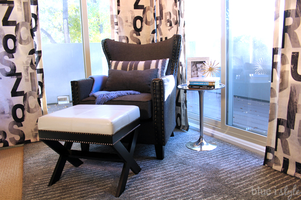
Since the Meloni armchair does not have a matching ottoman, and since the budget was tight, I purchased an inexpensive ottoman {which arrived needing some touch ups}. The Meloni has brass colored nailheads, and I already owned the silver side table. To tie everything together, I decided to add two rows of nailheads to the ottoman - one row brass, the other row silver.

Adding the nailheads was a bit labor intensive, but the adding this detail to the ottoman cost next to nothing and really makes it look so much higher end.

I am so excited to finally have a comfortable place to put my feet up and read {in all my spare time}. Reading for book club just got a whole lot more relaxing!


In the other corner of our bedroom is our large armoire. When we had babies in our room, I converted the armoire to baby central - with a changing station and all of the baby necessities {clothes, blankets, diapers, and swaddlers} hidden inside. Now that it is not longer needed as baby central, I have other plans for the armoire. The top of the armoire holds a small collection of metal skyline sculptures, but they were never much of a focal point.

To tie the armoire in with the rest of the room, and to highlight the sculptures, I picked up a shadow box canvas and created a quick and easy skyline painting {tutorial}.

I used metallic paints to help bounce the light around and add some interest to the top of the large black armoire, and to serve as a backdrop for the metal buildings.

Next to the armoire hang three more metallic NYC photos.

I spent a large portion of the last six weeks planning this gallery wall, and I couldn't be happier with how it turned out.

Read my Gallery Wall Planning Tutorial with lots of tips {especially great for those of you with Type A personalities, like me!}


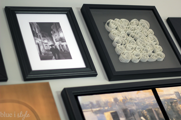
The gallery wall also gave me an excuse to finally frame the extra photo stamps for our wedding stationery {a project I've wanted to do for a long time}.

The television sits on top of a wood stand that we built a few years ago to hold our DVD player and Tivo. As a result, the tv sits quite high, so I wanted to add some height to each end of the dresser to help balance things out. On right side are three vases that I collected for the room over the years.

And on the right side is a new lamp that I feel head over heels in love with! It reminds me of an old streetlamp, which fits perfectly with the modern metropolitan style of the room.

Next to the lamp sits our wedding invitation in a double sided frame {the text of the invitation is visible on the other side}.

And here's how the gallery wall looks when the tv is on. I love that it now looks like just another piece of art in the mix. In the coming weeks, I'll share my tips for planning a gallery wall in a limited, fixed space.


I like our wall mounted sconces, but I feel like they makes nightstand styling more of a challenge. I did a lot of experimenting and tweaking, but I finally came up with his and hers styled nightstands that I am really happy with.

My husband's nightstand is made more masculine by the addition of a bowl of black baseballs {he painted that striped bowl himself when I dragged him to a paint your own pottery place when we were first dating}.


On my side of the bed, the nightstand is made more feminine by the addition of a vase of tulips, and a wicker basket on the bottom shelf now gives me a place to store my design magazines for late night reading.


We swapped out the builder grade sconces for these silver string sconces when we first moved in, and I love them just as much today as I did on day one. They fit perfectly with the new style of the room!

That concludes the tour of my One Room Challenge Modern Metro Master Bedroom. I feel like we now finally have a retreat - somewhere to escape to at the end a long day after the kids have fallen asleep. It took a lot of effort for me to not fill the room with photos of our kids - but I really wanted this space to be about the two of us as a couple. The rest of the house is for the family - this space is for us. I love everything about it and look forward to sleeping here for the first time tomorrow night {we temporarily relocated to our guest room while the work was ongoing}.
Want to see all of my other One Room Challenge projects? You'll find theme here.

Angela....you did a great room pulling it all together. The gallery wall worked out so well keeping the TV from being a focal point. Love the special touches you added throughout!
ReplyDeleteThanks, Sherry! I am really happy with the way your eye is now drawn to the art rather than the tv! Mission accomplished!
DeleteWow~ An absolutely stunning space! I love the gallery wall. As a fellow 6 week participant the six weeks was indeed a challenge and you rose up. Well done!
ReplyDeleteThanks so much! The six weeks is a major challenge, but I am so happy to have the room complete. If it weren't for the deadline, all the little projects in the room would have dragged on and on. I can't wait to check out your space as well!!
DeleteWonderful job, Angela! I LOVE how you've incorporated all of your sentimental photos throughout! And, that reading nook is so cozy, what a fabulous chair you chose! I can picture your entire family cozied up in here! :)
ReplyDeleteThanks, Pam! Yes, I think that fabulous armchair may become the new bedtime story spot! And it does make me so happy to be surrounded by our photos. I had to make a big effort not to fill the frames with pictures of our kids - but I think it's nice having a space that is about us as a couple since the rest of the house is filled with family and kid photos.
DeleteAngela, your room looks so relaxing and beautiful! I love the gallery wall you did. The whole room is so amazing!
ReplyDeleteThanks, Katie! The gallery wall is my fave as well!
DeleteYour room is gorgeous and I adore your accessories, especially the gallery wall.
ReplyDeleteThanks, Marty! I have wanted to do that gallery for a long time, so it's awesome to finally see it become a reality!
DeleteIt looks great! The gray paint really did make the fireplace pop & the gallery wall is perfect. I've had your PB inspiration gallery wall pinned forever as well and I think yours will be my new inspiration.
ReplyDeleteThanks, Melissa! That's a huge compliment! Your space is also just so fabulous!
DeleteYour gallery wall!!! Love it! Congrats on crossing the finish line! :) Everything looks amazing.xx.
ReplyDeleteThanks so much! The gallery wall makes me smile every time I walk into the room. Such an improvement because the tv and the blank wall never made me smile ;)
DeleteGreat job!! It all came together so well! I love all the special sentimental items. :)
ReplyDeleteThanks, Carrie! It always makes me happy to find a way to display sentimental items rather than just seeing them in a box once every few years. The aisle runner pillow might be my favorite!
DeleteGallery wall blends perfectly with the TV! Love the new nook and all the personal touches.
ReplyDeleteCheers on finally having that master bedroom retreat and getting rid of all the baby stuff! I love the new bedding and the picture frames above the bed really tie the room together! I have to say my favorite part of the room is the fab gallery wall and of course the pillow as a wedding and event planner. :) That chair with the nailhead trip and ottoman are fab too! Bravo my ORC friend on a job well done!
ReplyDeleteThanks, Sarah! The aisle runner pillow is one of my favorite parts of the room as well! We bought those pictures above the bed on clearance about a year ago, so I am just thrilled to finally have them up on the wall! :)
DeleteLove your gallery wall! Congratulations on a beautiful space!
ReplyDeleteThanks so much!!
DeleteLove this transformation! I also love that awesome chair (and the fact that Friends was on the tv...one of my fave shows!). Great job :)
ReplyDeleteThanks, Erin! The chair is so much more comfortable for reading than the one we had before - perfect for curling up! And Friends - LOVE! It's on A LOT in my house! In fact, I am watching another rerun as I type this {The One With the Thumb} :)
DeleteWhat an awesome job! I am so inspired. You have some talent and no detail or corner left undone. I love everything about it and can't wait to see the tutorials next week. What a great idea with the baseballs...
ReplyDeleteThanks, Tiffany! You are so sweet! I think putting together the details of a room is the part I enjoy the most!
DeleteYour gallery wall is amazing and love the graphic fabric you used for the curtains!
ReplyDeleteThanks, Kim! I fell in love with that fabric the moment I saw it. I know it wouldn't be for everyone, but I think it's perfect for this space!
DeleteYou pack so much style into this room. My favorite is the art wall around the TV. Great job!
ReplyDeleteThanks so much!
DeleteYes!!! What I love is that you designed the perfect, beautiful space for you guys. Love the personal styling (baseballs), and the gallery wall. Awesome!
ReplyDeleteThanks - that's a great way to put it. It is the perfect space for us. It was really fun designing a space that was just about the two of us and our favorite things!
DeleteGood job Angela! I love your gallery wall, also your brick wall.
ReplyDeleteThanks,Delia!
Delete
ReplyDeleteangela, this looks like an amazing retreat. It's nice to read that you had another place to sleep. I love your gallery wall and your selection of color. Great job.
I love the wall gallery - it's perfect - I can tell you spent a lot time on this! I love the entire room - you will enjoy this for years! Great job!
ReplyDeleteShelia @ House of Highlands
Thanks, Sheila!
Deletepretty incredible! love that gallery wall {which i suspected i would} and taking it all the way to the ceiling was perfect. chair looks amazing, as does the ottoman...nail heads are a pain but add such great character. well done...hope to see you back at the spring ORC!
ReplyDeleteThanks, Tara! I really debated about taking the gallery wall up to the ceiling, but I think it was the right choice. And yes, the nailheads were a pain - but worth it in the end!
DeleteFirst, sorry I’m just now getting over here! I hit publish on my room and ran out the door on vacation. Secondly…this room is fabulous!! It feels like a chic hotel suite right off of central park!!! :) I love all the artwork and your new reading chair is gorgeous!! Love all the fabrics too! Well done!!!
ReplyDeleteThanks, Kate! That's a huge compliment and pretty much exactly what we were going for! :)
DeleteGreat work, Angela. The room turned out beautifully! Your description of what you were looking for in a reading chair way back in one of the first posts had me nodding my head in agreement and I went out and made my own reading nook - you're an inspiration!
ReplyDeleteThis is an AMAZINGLY AWESOME room!! I have two questions for you... 1. Where did you get that fabulous lamp? 2. Where did you get those "NY" and "LA" canvases above your bed?
ReplyDeleteCan you tell me where your scones are that are hanging on the wall next to your bed? I love them!!
ReplyDelete